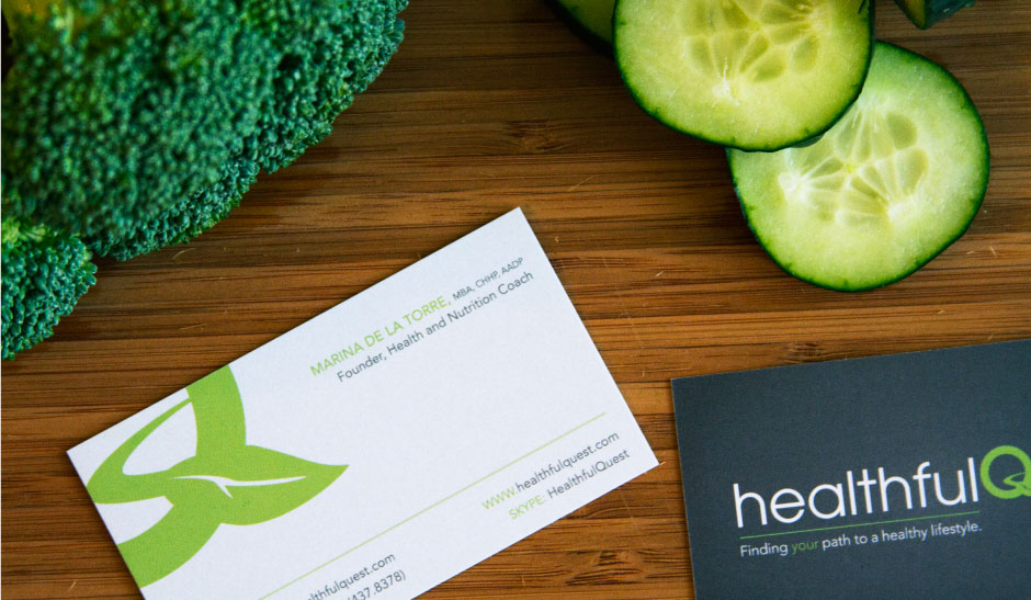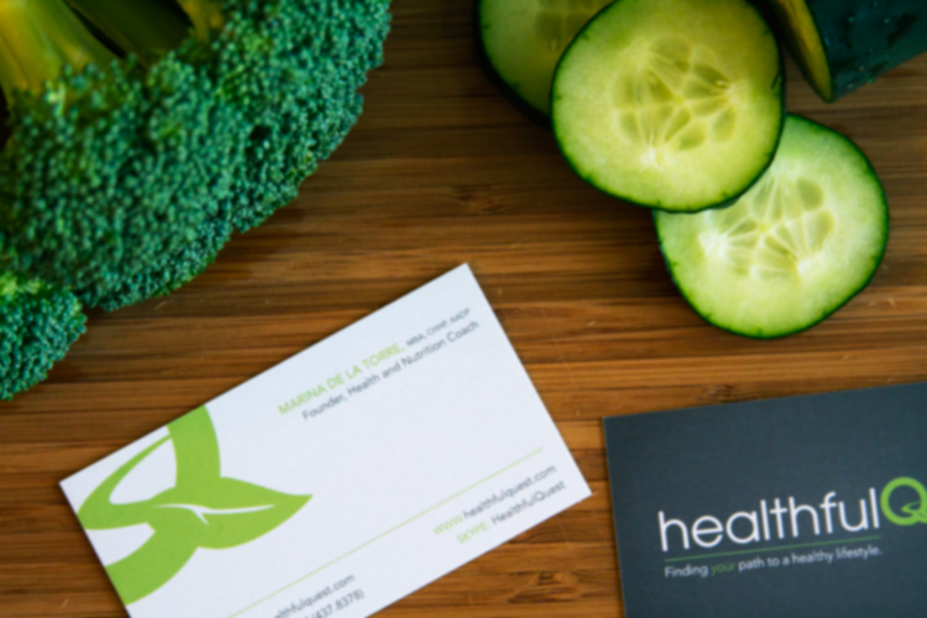

Brief:
Establish a new identity for a health and wellness company capturing the owners personal style and implying motion.
Solution:
The “Q” letterform became the perfect canvas for a road and leaf addition. This subtle adaptation when supported by conservative type, sets the desired tone for the targeted institutional clients while retaining a personality relatable to individuals.
Healthful Quest